UI/UX & Interactive Design
Responsive Web App UI/UX: Humber Current Redesign
PROJECT OVERVIEW
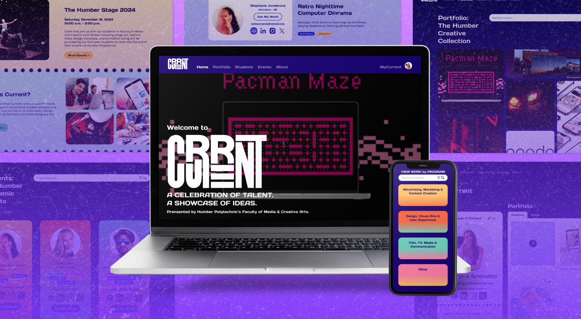
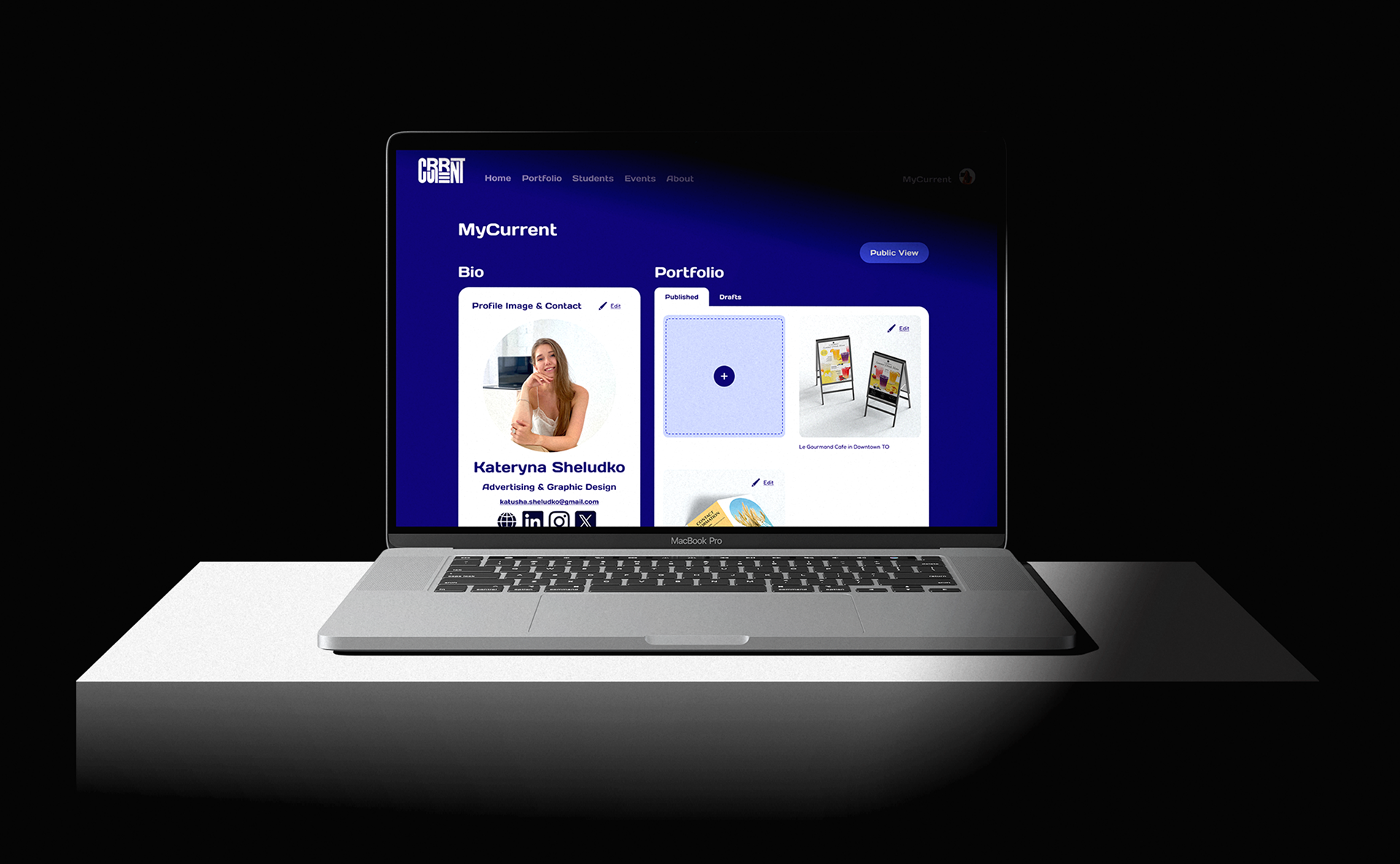
This is a collaborative UI/UX redesign project done by designers Hoi Ki Kong and Ka Yan Lo. This redesign for Humber Current transforms the existing students’ portfolio website into a responsive web app, enhancing usability and interactivity for students and graduates at Humber Polytechnic. By introducing MyCurrent, a personalized login system, users can now edit, upload, and manage their project work—similar to a social media profile.
Scope
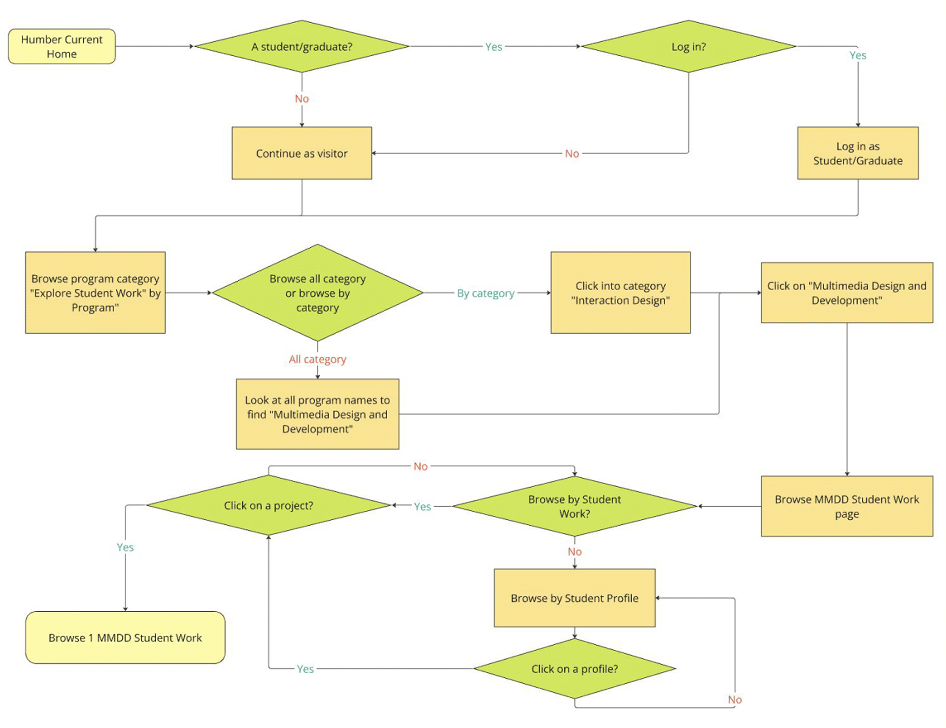
User Flow Diagram
Sketches/Rapid Prototypes
Style Tiles
UX & User Testing
Clickable High-fidelity Prototypes
Key Insights
The Humber Current redesign empowers students to update their projects post-graduation. Overcoming Figma challenges—tool limitations, lag, and a learning curve—we leveraged online tutorials, peer support, and self-exploration.
User testing and design reviews provided valuable feedback on colors, layout, and content, refining the final design for better usability and engagement.

CREATIVE PROCESS
1. Project Research & Planning
My teammate and I began by analyzing the existing Humber Current portfolio website to identify areas for improvement on each page. We aimed to create a more engaging and user-friendly platform that would allow Humber students and graduates to manage their projects with ease. Our goal was to transform Humber Current into a dynamic web app with a personalized experience through MyCurrent.
2. Sketches, Style tiles & User flow diagram
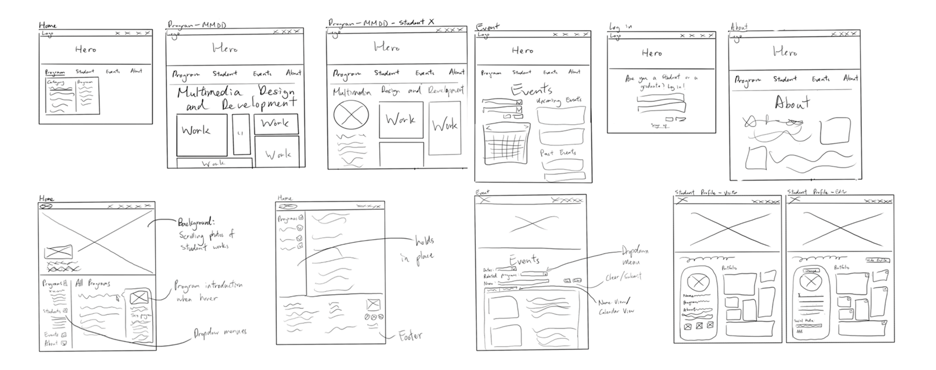
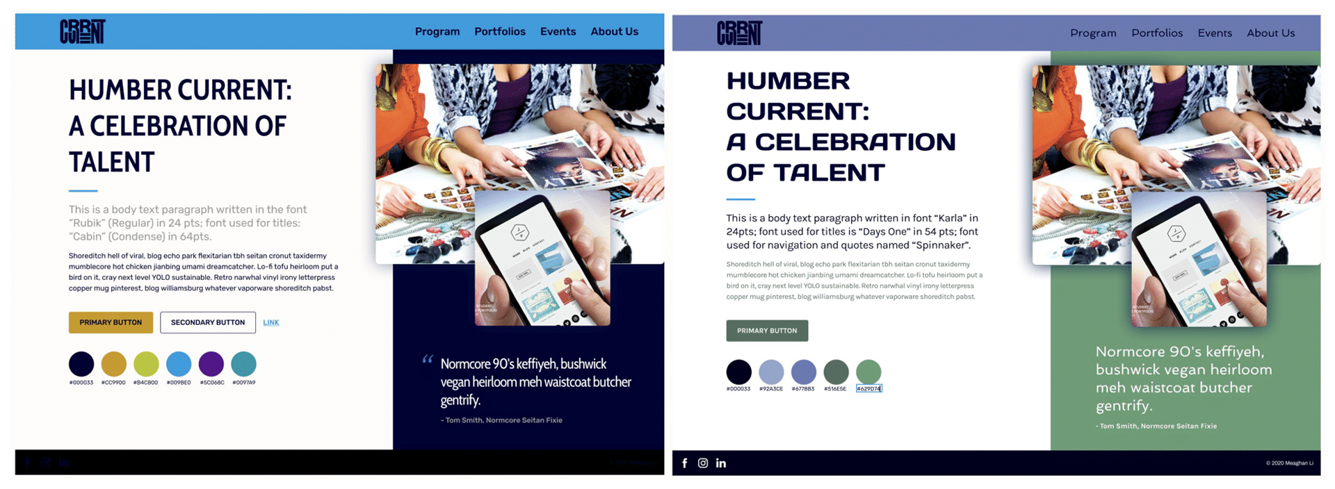
After identifying all the pain points and areas for major redesign, we developed wireframes sketches and style tiles, refining the visual direction and user flow. To optimize efficiency, we divided tasks strategically, ensuring a smooth and collaborative workflow throughout the redesign process.
3. Mid-Fidelity Wireframes & UI KIT DEVELOPMENT
the next step is to develop detailed wireframes to refine the structure and user experience of the Humber Current web app. These wireframes will help map out the layout, functionality, and interactions before moving into high-fidelity design.
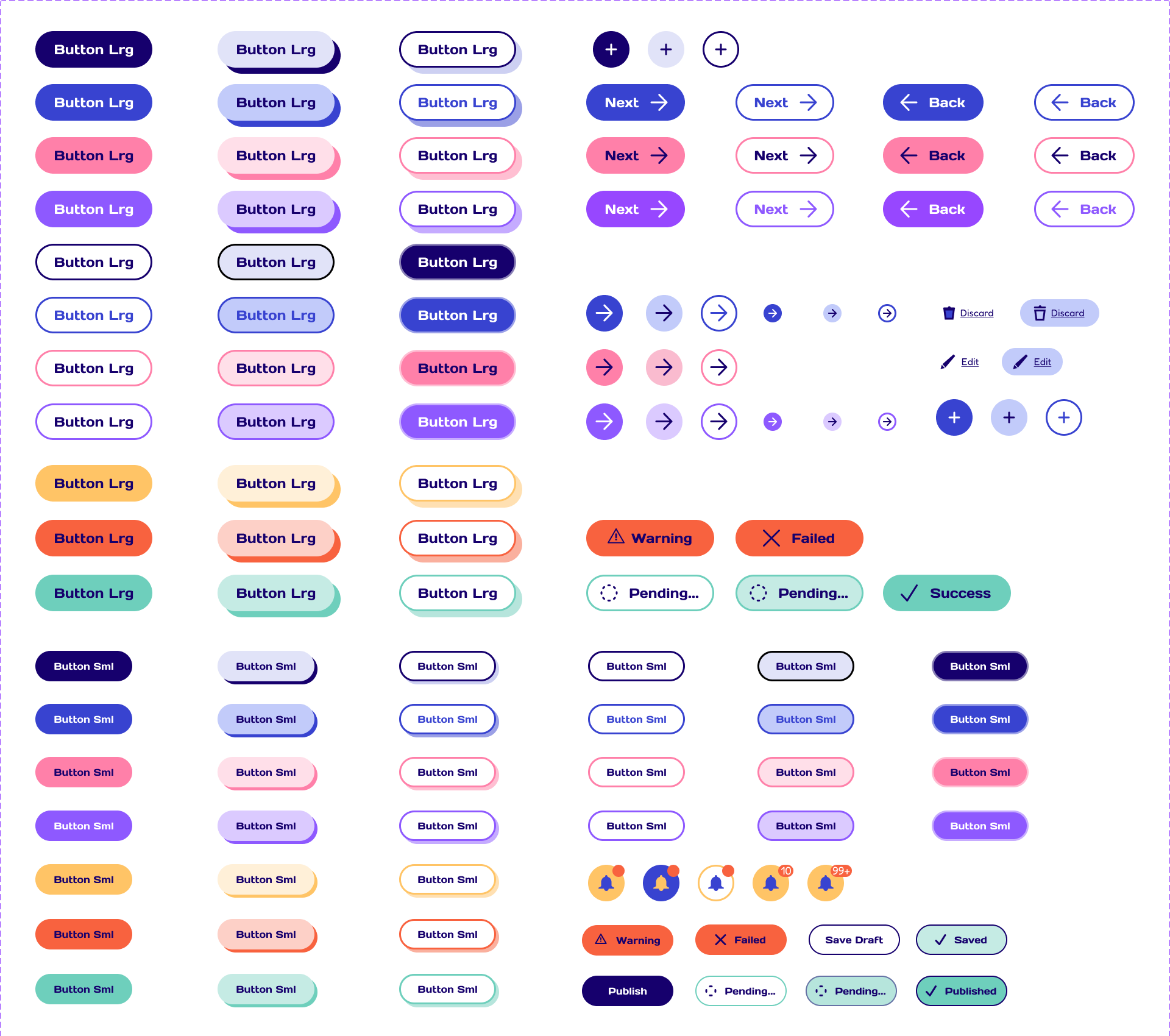
Additionally, we enhanced the UI kit, refining typography, color schemes, button styles, and other UI components to ensure consistency and usability across the site. This stage will focus on balancing aesthetic appeal and functionality, creating a seamless and engaging user experience for Humber students.
4. Design Reviews & High-Fidelity Prototype
During user testing, we gathered valuable feedback that guided our final refinements. Key insights included adjusting button sizes for better accessibility, clarifying unclear wording (e.g., “View by Program” needed more context), and improving search filters to allow users to find projects by specific skills like UX/UI design or branding.
We also introduced a “Save Project” option before publishing, reduced negative space in the “View by Program” section, and refined the portfolio page layout to keep text minimal and focus more on visual work. Using these insights, we built high-fidelity wireframes and developed a clickable Figma prototype, ensuring an improved user experience with a more intuitive and polished design.


