Branding & Identity
Italian Restaurant Brand Identity:
Pasta Factory
PROJECT OVERVIEW
This conceptual branding project for Pasta Factory, an Italian restaurant, aims to establish a cohesive visual identity and design a responsive website that reflects the brand’s authenticity and craftsmanship.
Brand vision
Pasta Factory is a Toronto-based Italian restaurant concept that brings the heart of Italy to Toronto with handcrafted pasta, authentic flavors, and live pasta-making demonstrations.
It provides an inviting space for pasta lovers to enjoy authentic Italian cuisine and participate in hands-on pasta-making workshops.
Scope
Brand Logo & Variations
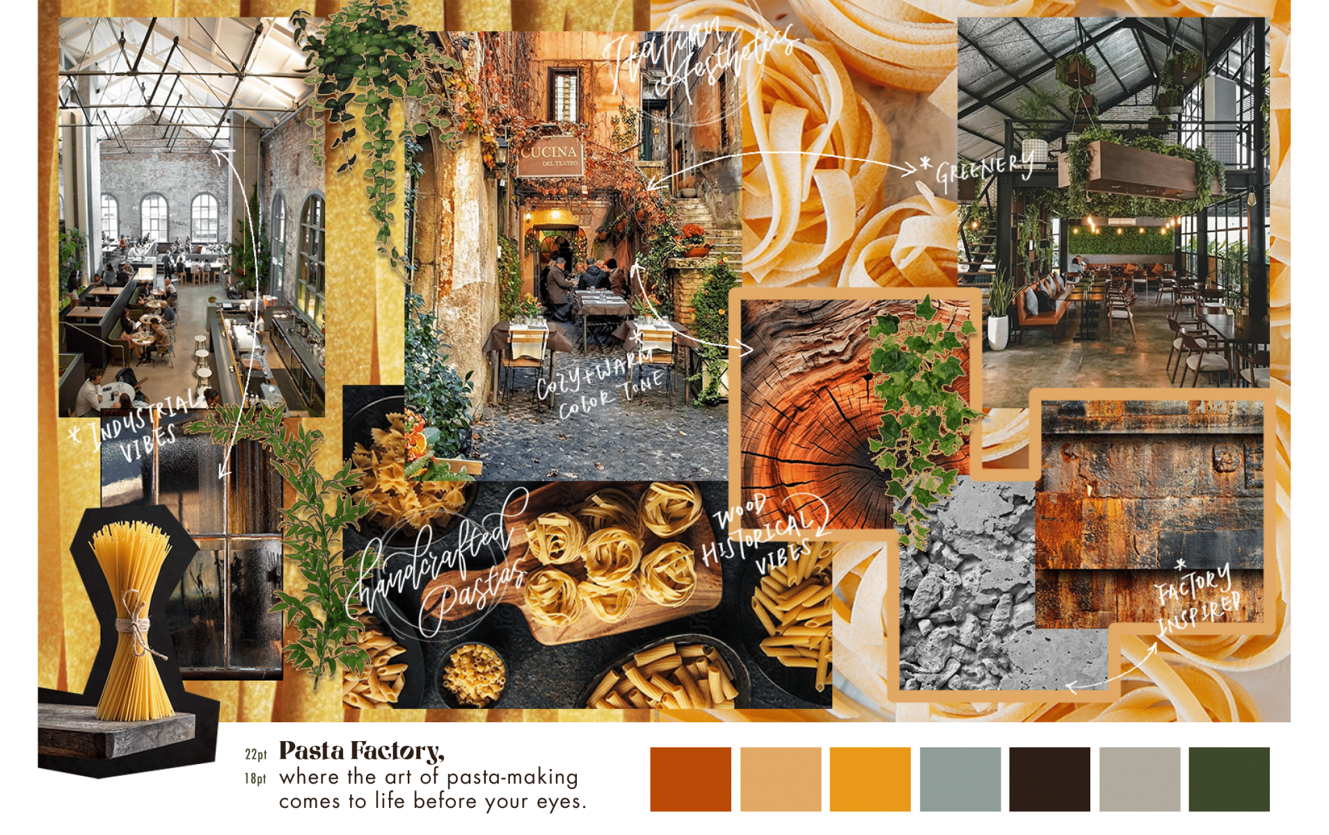
Moodboard
Icons Set
Brand Style Guide
Dynamic Website UI Wireframes (high fidelity)
Clickable Website Prototype (mobile & desktop)


CREATIVE PROCESS
1. Project Research & Planning
I started by researching on the business type of the brand (ie. Italian restaurant) and tried to figure out their personality and characteristics by researching their target audience first.
2. Logo Ideation & Sketching
After researching on a list of keywords related to the brand’s personality, I started to brainstorm ideas of the brand logo in Procreate, by filling in the grids of a morphological matrix with sketches.
I developed my ideas through the type elements (ie. the brand name, Pasta Factory) and 7 more picture elements, such as pastas, factory, chef hat, etc. and created 56 initial silhouettes of the brand logo. Then, 10 more rough sketches were created, and a final draft was chosen to be modified and turned into 3 versions.


3. Vectorizing Logo, Color Palette & Moodboard
With feedback received from my supervisor, I proceed with one chosen logo design and vectorized it in black and white in the Adobe Illustrator. I then colored the logo and created variations to suit different occasions. The colors applied to the logo design then became primary colors of the brand’s color palette. After that, I created a moodboard in Procreate, to express the emotions and aesthetics of the brand visuals.

4. Typography, Icons Design & Style Guide
After determining the brand’s logo and tone, I continued by searching for suitable typefaces and font styles, sketching and vectorizing icon designs. I designed a set of 10 icons, in 3 illustration styles to be applied on brand collaterals and their website. Then, I created a one-page style guide to indicate the use of each designed branding elements.

5. Website Wireframes & Clickable Prototypes
After the branding visuals done, I created a low-fidelity wireframes of the wireframes in Figma. I designed the “Home”, “Reservation”, “Menu” and “Learn Pasta” pages for both the desktop and mobile websites of the brand. Finally, after testing with the low-fidelity wireframes, a clickable and responsive prototype (high-fidelity wireframes) was done in Figma.


